After seeing a bunch of sacred art, I also saw some secular art at the National Gallery of Art in Washington, D.C.
 |
| Side entrance to the National Gallery of Art |
When we visited, the gallery had a special exhibit on German Expressionism in print, paintings, and drawings. I love a bunch of silent-era German films that use expressionism in their visuals (Metropolis, Nosferatu, and The Cabinet of Doctor Caligari being the most famous examples). I was naturally interested in the exhibit.
 |
| The intro graphic |
Self Portrait in Profile, Facing Left, While Drawing, is by Kathe Kollwitz in 1933.
 |
| Self Portrait in Profile, Facing Left, While Drawing, click to enlarge (hereafter CTE) |
Most Expressionistic art is in black and white, probably to provide stark contrast. A sense of melancholy or stress is often found in Expressionism, this piece leans towards melancholy.
Umbra Vitae, which translates as "Shadow of Life," is the title of a book with two drawings (the title page and the red and black image) by Ernst Ludwig Kirchner. He paired the drawings (along with other drawings inside the book) with poems by Georg Heym, whose work had a haunting effect on Kirchner.
 |
| Title page from Umbra Vitae |
This example is more of what I expected. The blocky images provide more stress and surreality. The character's shadows suggest their inner feelings in high contrast. The weird images are fascinating and captivating.
Frau im Wald (Woman in the Woods) is a woodblock print by Karl Schmidt-Rottluff in 1921.
The weird angles and harsh visuals give the sense that this walk in the woods is full of danger and anxiety. This is not a happy woman or a safe place to be.
 |
| Frau im Wald |
The weird angles and harsh visuals give the sense that this walk in the woods is full of danger and anxiety. This is not a happy woman or a safe place to be.
A lot of the other art in the exhibit is more graphic and bleak. The experience made me want to stick with the films!
Outside, the gallery has larger sculptures in a garden setting. Wandering Rocks is a set of abstract 3D geometric shapes crafted in 1967 by Tony Smith.
To me, they seem like 3D tangrams, like a visitor should be able to put them together to make other figures or images. Of course, visitors are not supposed to touch the works and they are all over 360 pounds, so a lot to lift or move, even if you were allowed to do such things.
 |
| Wandering Rocks |
To me, they seem like 3D tangrams, like a visitor should be able to put them together to make other figures or images. Of course, visitors are not supposed to touch the works and they are all over 360 pounds, so a lot to lift or move, even if you were allowed to do such things.
Spider by Louise Bourgeois in 1997 is a bit creepy, not the sort of thing you want to see in a dark alley in the dead of night.
 |
| Spider |
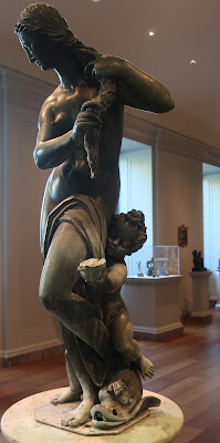
Back inside, I went downstairs to the sculpture area for a change from the paintings above. Sculptures are fascinating to me because seeing pictures of them does not do justice to the work. Since it is three-dimensional, the sculpture needs to be seen from more than one angle for full appreciation. A good example is Venus and Cupid, crafted by followers of Giovanni Bologna in 1575.
 |
| Venus and Cupid, CTE |
 |
| Venus and Cupid, CTE |
The statue is meant to be part of a fountain, so Venus's hair probably would be dripping into Cupid's conch shell. She has a classical look while her son has more of a playful, outdoorsy feel that goes with a fountain. One has a hard time seeing all the rich detail with just photos.
Another example of "it needs to be seen in person" is Veiled Bust (The Veiled Nun), after the style of Giuseppe Croff, sculpted in 1863.
 |
| Veiled Bust |
The delicate marble carving suggests a translucent cloth across the face of a woman. The effect is amazing. From every angle it looks like a sheer veil. From a distance, one might think someone threw a veil over the bust. I spent quite a while admiring the craftsmanship.
The Thinker by Auguste Rodin is a famous sculpture with many copies all over the world. The gallery has one as well.
 |
| The Thinker |
The statue was originally made to be part of a larger "Gates of Hell" composition that was never completed. Intended to represent the poet Dante, it became a universal figure for contemplation.
In the halls downstairs, I spotted this Degas painting called Four Dancers from 1899.
 |
| Four Dancers |
The painting shows the joyous preparation, maybe for a stage performance or an outdoor performance. Whether the back dancer's hand is on a prop or on an actual tree is unclear. They have energy and elegance, making a delightful scene.


No comments:
Post a Comment